bob@nbdho.com
Color Matching Tips in Wall Calendar Design
Color Matching Tips in Wall Calendar Design
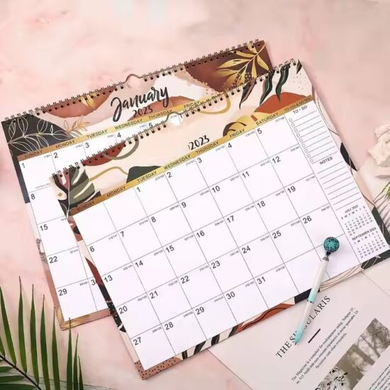
Color plays a vital role in wall calendar design, affecting both the aesthetic appeal and usability of the final product. Proper color matching can help highlight important dates, improve readability, and create a mood that resonates with the target audience. Whether you’re designing for corporate clients, retail, or personal use, understanding color theory and practical tips can elevate your wall calendar’s impact.
1. Understand Color Psychology
Different colors evoke different emotions and responses. For example:
-
Blue conveys trust and calmness—ideal for corporate calendars.
-
Red signals urgency and excitement—great for highlighting important dates.
-
Green symbolizes growth and harmony—suitable for eco-friendly or wellness-themed calendars.
Use colors purposefully to align the calendar’s tone with its purpose.
2. Use a Harmonious Color Palette
Choose colors that complement each other well. Popular color schemes include:
-
Analogous colors (colors next to each other on the color wheel, like blue, green, and teal) for a soothing effect.
-
Complementary colors (colors opposite each other, like red and green) for high contrast and emphasis.
Keep the palette balanced—too many contrasting colors can be distracting.
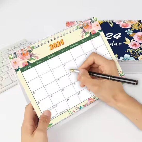
3. Prioritize Readability
Calendar text, especially dates and important notes, must be easy to read.
-
Use high contrast between text and background colors (e.g., dark text on a light background).
-
Avoid color combinations that cause eye strain, such as red text on a green background.
-
Reserve bright or bold colors for highlighting key information only.
4. Consider Brand Colors
For corporate or promotional calendars, integrate brand colors consistently to reinforce identity. Ensure that brand colors do not overpower the calendar’s usability but enhance overall design cohesion.
5. Balance Warm and Cool Colors
Warm colors (reds, oranges, yellows) can energize a design, while cool colors (blues, greens, purples) tend to calm and soothe. Combining these appropriately can create a dynamic yet balanced visual effect.
6. Test in Different Lighting Conditions
Colors can look different under various lighting (natural light, fluorescent, LED). Always test your calendar design in the environment where it will be displayed to ensure colors maintain their intended appearance.
Conclusion
Effective color matching is a cornerstone of successful wall calendar design. By understanding color psychology, choosing harmonious palettes, prioritizing readability, and aligning with brand identities, designers can create calendars that are both beautiful and functional. Applying these tips will help your wall calendars stand out in a competitive market and leave a lasting impression on users.