bob@nbdho.com
How to Design a Visually Impactful Poster Calendar
How to Design a Visually Impactful Poster Calendar
Creating a poster calendar that stands out visually while remaining functional requires a careful balance of creativity and practicality. Whether you are designing for corporate branding, promotional giveaways, or personal use, an impactful poster calendar can leave a lasting impression and increase user engagement. Here are some key tips and best practices for designing a visually striking poster calendar.
1. Understand the Purpose and Audience
Before starting the design process, clarify the calendar’s purpose and target audience. Is it for corporate clients, retail customers, or internal use? Knowing who will use the calendar helps guide design choices, color schemes, and messaging.
2. Choose the Right Size and Layout
Select a size that suits the intended placement, such as office walls, retail counters, or home spaces. Common sizes include A1, A2, and B2. A clear, organized layout is crucial to ensure the calendar is easy to read and visually balanced.
3. Use Bold and Consistent Branding
Incorporate logos, brand colors, and fonts consistently throughout the design. Bold branding helps reinforce brand identity and ensures the calendar aligns with other marketing materials.
4. Prioritize Readability
Dates, holidays, and important events should be clearly visible. Use legible fonts and sufficient contrast between text and background. Avoid clutter by limiting the amount of text on each page.
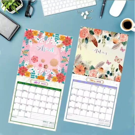
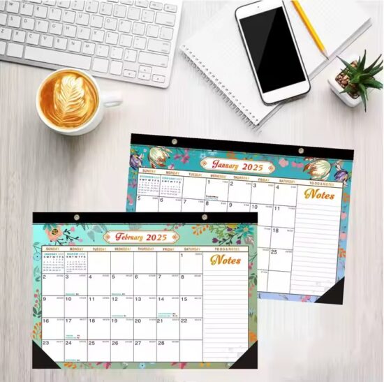
5. Incorporate Eye-Catching Visuals
High-quality images, illustrations, or graphics related to your brand or theme add visual interest. Use colors that complement the overall design without overpowering the calendar information.
6. Balance Functionality and Aesthetics
While aesthetics are important, the calendar must serve its primary function: helping users keep track of dates. Ensure that the calendar grid is spacious and easy to use, with clear indications of weekends, holidays, and special occasions.
7. Add Interactive or Creative Elements
Consider including tear-off pages, writable areas, QR codes linking to digital content, or augmented reality (AR) features to enhance user engagement and add modern appeal.
8. Pay Attention to Material and Finish
Choose paper types and finishes that enhance the design and durability. Matte finishes reduce glare for better readability, while glossy finishes make colors pop. UV coating or lamination can protect the calendar from wear and tear.
Conclusion
Designing a visually impactful poster calendar involves combining clear, functional layouts with strong branding and attractive visuals. By understanding your audience and purpose, prioritizing readability, and incorporating creative elements, you can create a calendar that not only serves as a useful tool but also leaves a memorable impression.